
Abstract
The project is developing unsupervised machine-learning models to group customers into segments for the purpose of giving insurance product recommendations. Customers are divided into subgroups based on some types of similar characteristics. The dataset includes summary information on 18 behavioural variables from the 8,950 active credit cardholders. Behaviours include how a customer spends and pays over time. The notebook explores different unsupervised algorithms such as k-means, hierarchical clustering, and DBSCAN for an insurance company to divide customers into groups to optimize marketing campaigns for insurance products. Standardization is used to rescale data to have a mean of 0 and a standard deviation of 1. PCA and TSNE methods are used for dimensionality reduction and visualization. After comparing with the silhouette score and visualized plots, the optimal model is the k-means method with a k value of three that is trained with PCA scaled data. There are small groups of people who have similar behaviours on purchasing, cash advances, credit limits and so on. The K-means clustering method helps identify the group that has similar features. After the segmentation, an insurance company will provide insurance product recommendations based on their characteristics.
Use Case
The insurance industry is competitive. Building strong relationships with customers and maintaining customer engagement outside a claim or a renewal is important. An insurance company is developing a machine learning model to classify customers to provide recommendations on insurance products. Customer segmentation is dividing customers into different groups that have similar characteristics, needs, or goals. The insurance company can offer various products such as saving plans, loans, wealth management and so on to different segments. A successful machine learning model can help the company optimize marketing campaigns, identify new opportunities, and increase customer retention rates.
Dataset
The sample Dataset summarizes the usage behavior of about 8,950 active credit cardholders during the last 6 months. The file is at a customer level with 18 behavioral features:
- CUST_ID: ID of Credit Card holder
- BALANCE: Balance amount left in their account to make purchases
- BALANCE_FREQUENCY: The frequency of the balance is updated, the score is between 0 and 1 (1 = frequently updated, 0 = not frequently updated)
- PURCHASES: Amount of purchases made from the account
- ONEOFF_PURCHASES: Maximum purchase amount done in one attempt
- INSTALLMENTS_PURCHASES: Amount of purchase done in installment
- CASH_ADVANCE: Cash in advance given by the user. A cash advance is a service provided by credit card issuers that allow cardholders to immediately withdraw a sum of cash, often at a high-interest rate.
- PURCHASES_FREQUENCY: The frequency of the purchases being made, a score between 0 and 1 (1 = frequently purchased, 0 = not frequently purchased)
- ONEOFF_PURCHASES_FREQUENCY: The frequency of the purchases done in one attempt (1 = frequently purchased, 0 = not frequently purchased)
- PURCHASES_INSTALLMENTS_FREQUENCY: the frequency of the purchases in installments are being done (1 = frequently done, 0 = not frequently done)
- CASH_ADVANCE_FREQUENCY: The frequency of the cash in advance given by the user
- CASH_ADVANCE_TRX: Number of cash advance transactions being made
- PURCHASES_TRX: Number of purchase transactions being made
- CREDIT_LIMIT: The limit of credit card for the user
- PAYMENTS: Amount of payment done by the user
- MINIMUM_PAYMENTS: Minimum amount of payments made by the user
- PRC_FULL_PAYMENT: Percent of full payment paid by the user, a score between 0 and 1
- TENURE: Tenure of credit card service for user
Load and Read the Data
df = pd.read_csv("Customer Data.csv")
There are 18 columns in this dataset. The CUST_ID is an object and it is the customer ID that is used to identify the customer. We may drop it since it is not one of the behavior features. CASH_ADVANCE_TRX, PURCHASES_TRX, and TENURE are integers. Any other columns are float data types.
Data Cleaning
There are 313 MINIMUM_PAYMENTS and 1 CREDIT_LIMIT has a null value.
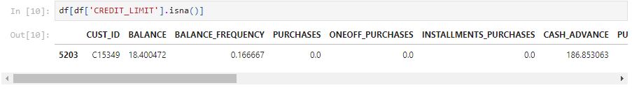
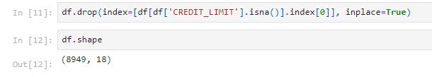
Because there is only one customer with an empty CREDIT_LIMIT, we can drop this row.
Let’s fill the 313 MINIMUM_PAYMENTS with the mean value.
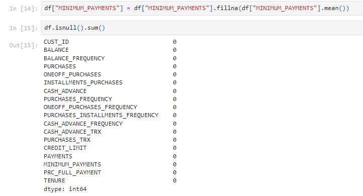
There are no null values in the dataset.
We can check if there are any duplicate rows in the dataset.

There are no duplicate rows in the dataset.
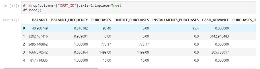
The CUST_ID is an object and it is the customer ID that is used to identify the customer. We may drop it since it is not one of the behavior features.
Analysis and visualization
The describe function can help find the min, mean, max, and standard deviation of each feature.
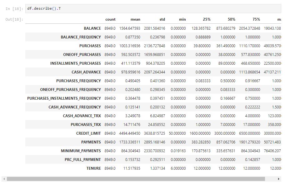
From the table above, there are some outliers when looking at the max value. Because they could contain important information about that customer so the outliers can be treated as extreme values in this case.
We can use the heatmap from the Seaborn library to view the correlation coefficient.
									plt.figure(figsize=(15,15))
sns.heatmap(df.corr(), annot=True)
plt.show()
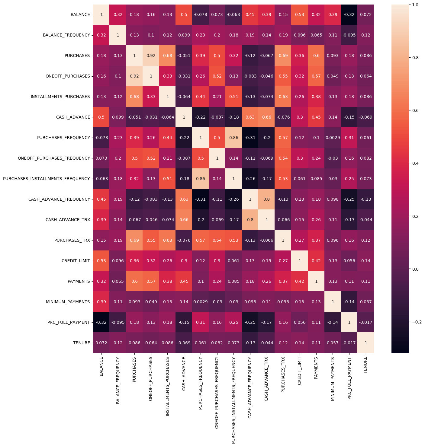
PURCHASES and ONEOFF_PURCHASES have a strong correlation because the magnitude is 0.916844, which is high.
PURCHASES_INSTALLMENTS_FREQUENCY and PURCHASES_FREQUENCY also have a high correlation with a 0.862921.
sns.pairplot(df)
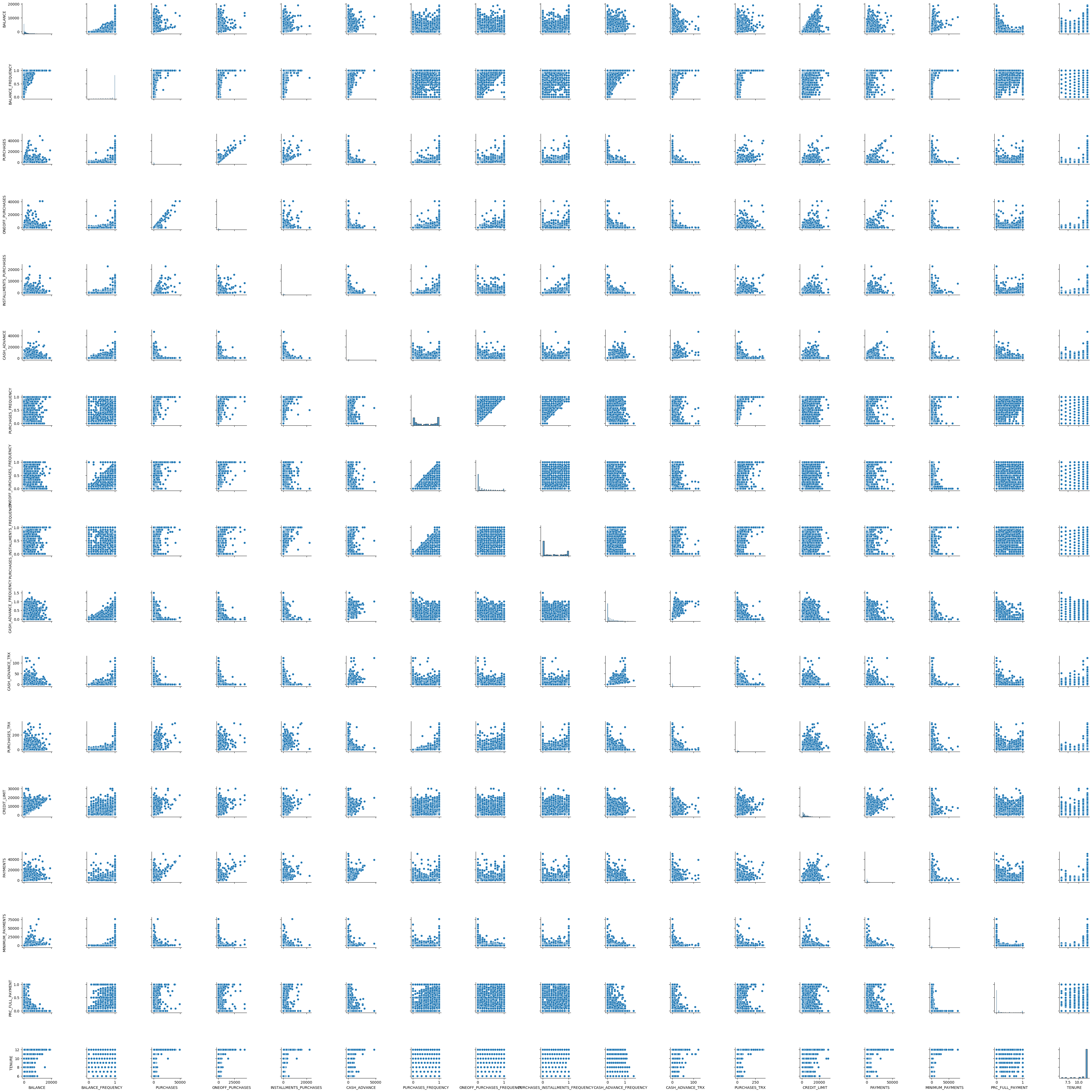
Notice that some areas from the plot above are high-density. It looks like we can apply an algorithm to separate high density with a cluster of low density.
df.hist(bins=12, figsize=(20, 15), layout=(5,4));
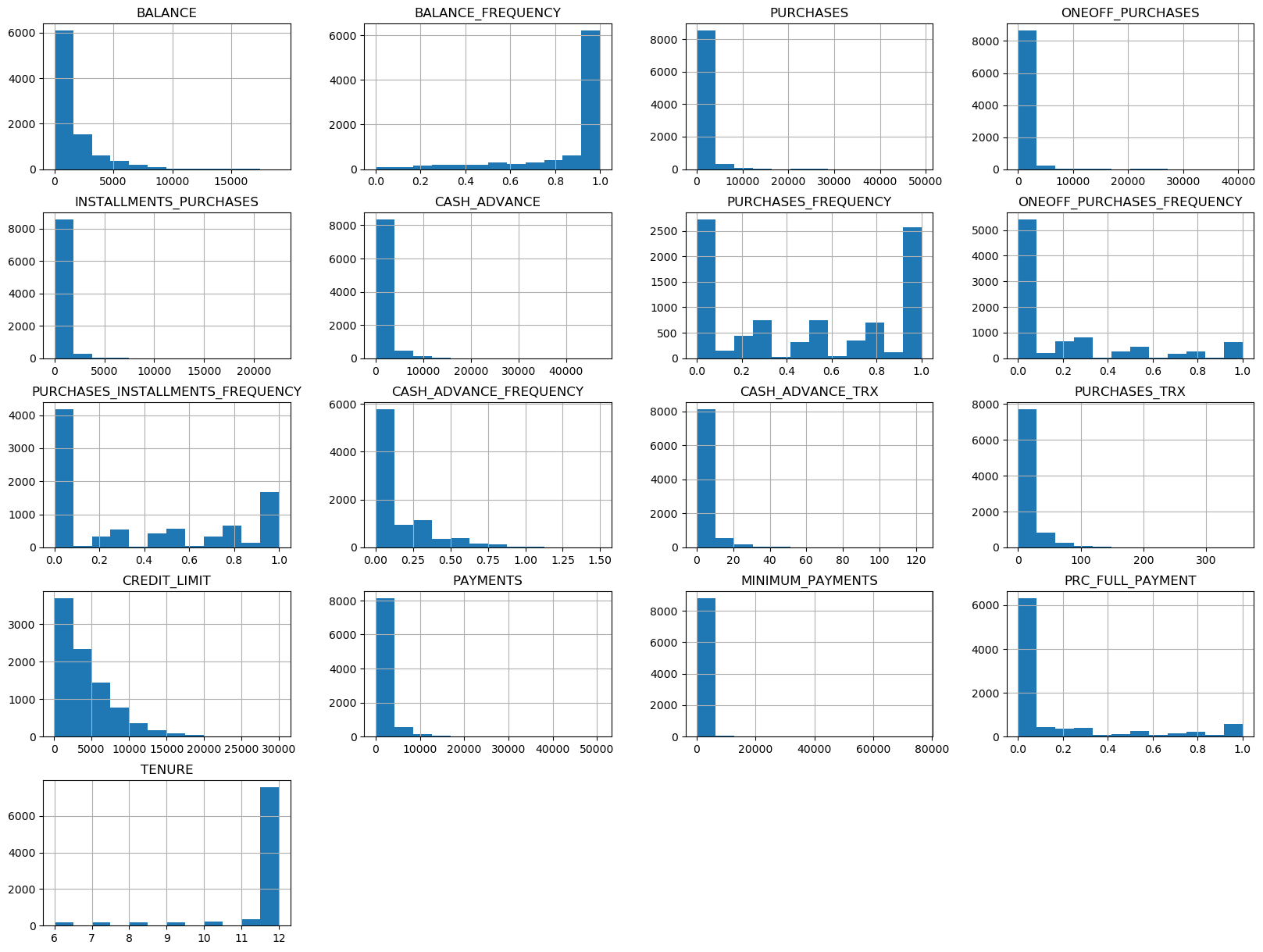
From the above plots, notice that most of the graphs are skewed. The reason could be most customers have some common in one feature.
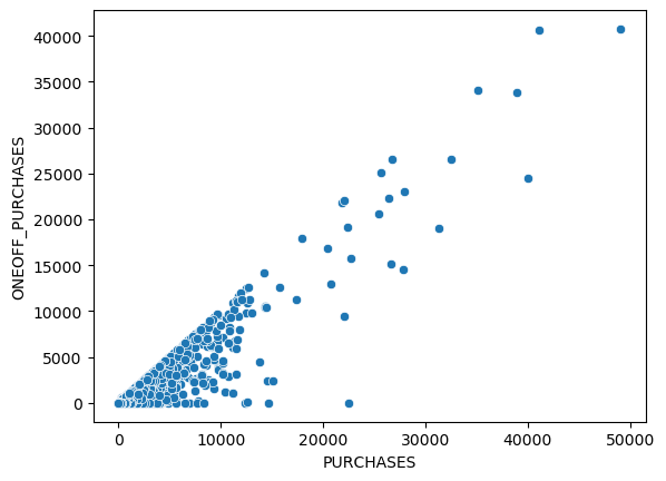
sns.scatterplot(x='PURCHASES', y='ONEOFF_PURCHASES', data=df);
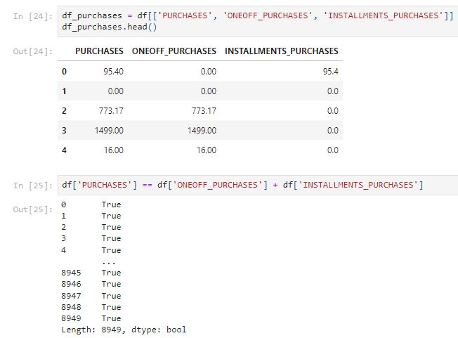
									df_purchases['SUM_OF_ONEOFF_INSTALLMENTS'] = df_purchases['ONEOFF_PURCHASES'] + df_purchases['INSTALLMENTS_PURCHASES']
df_purchases.loc[df['PURCHASES'] != df_purchases['ONEOFF_PURCHASES'] + df_purchases['INSTALLMENTS_PURCHASES']]
From the above analysis, we can see that most of the purchase is equal to the sum of the one-off purchase and installment purchase. Only a few customers such as the one on row 8834 who has a high installment purchase.
									fig1, ax1 = plt.subplots(figsize=(8, 8))
ax1.pie(df['TENURE'].value_counts(), autopct='%1.1f%%', pctdistance=1.1)
ax1.legend(df['TENURE'].value_counts().index)
ax1.axis('equal')  # Equal aspect ratio ensures that pie is drawn as a circle.

plt.title("Percentage by the Tenure")
plt.show()
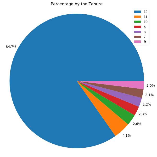
From the pie chart above, we can see about 84.7% of users have a 12 months tenure.
sns.boxplot(x = 'TENURE', y = 'CREDIT_LIMIT', data = df)
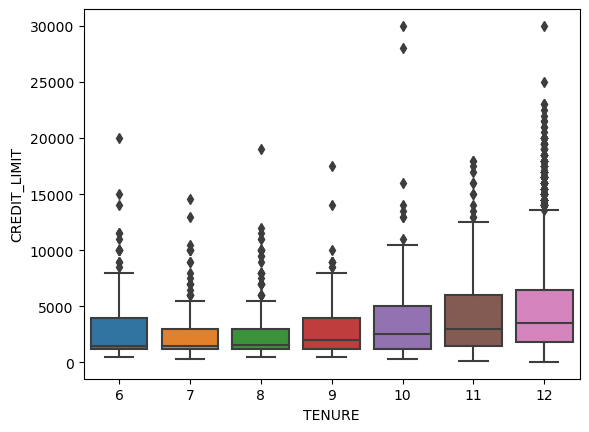
From the boxplots above, we can see that user who has longer tenure also tends to have a higher credit limit.
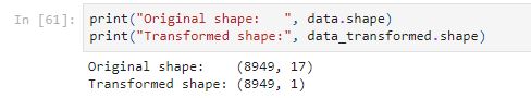
									fig1, ax1 = plt.subplots(figsize=(8, 8))
ax1.pie(df['PRC_FULL_PAYMENT'].value_counts(), autopct='%1.1f%%', pctdistance=1.1)
ax1.legend(df['PRC_FULL_PAYMENT'].value_counts().index)
ax1.axis('equal')  # Equal aspect ratio ensures that pie is drawn as a circle.

plt.title("Percentage by the PRC_FULL_PAYMENT")
plt.show()
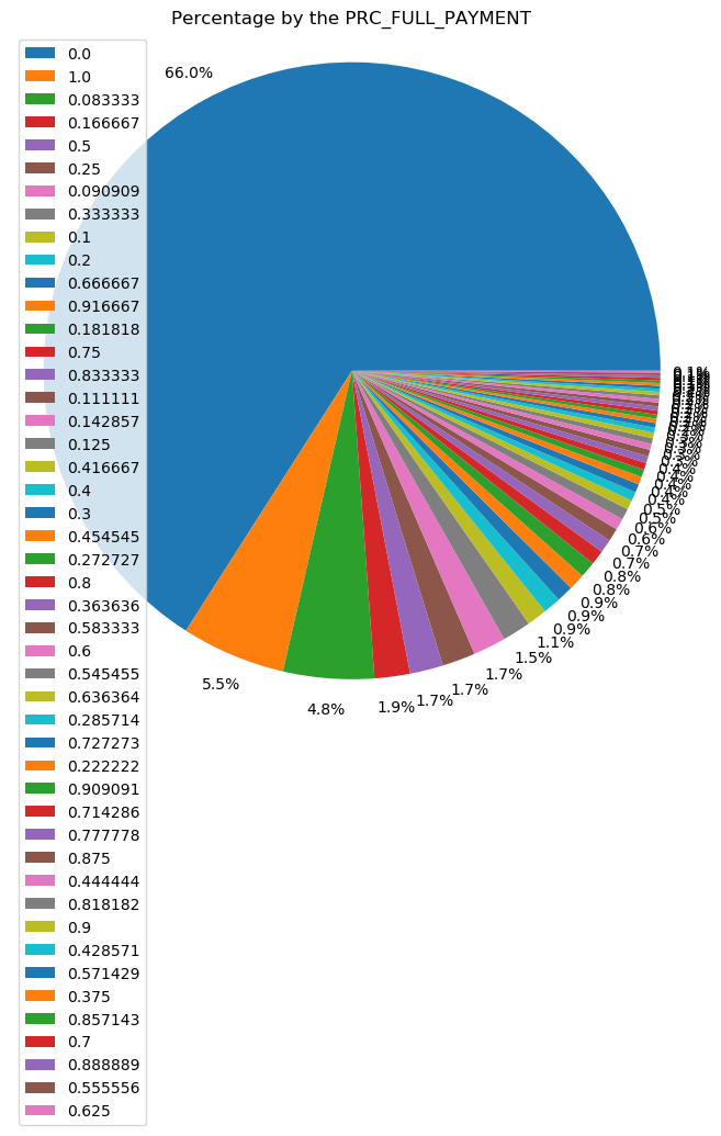
From the pie chart above, only 5.5% of users made full payments. Surprisingly, about 66% of users with 0% of full payment paid. Users who made a full payment could have enough money in their savings, the company may offer a wealth management plan or saving plan to those users.
sns.scatterplot(x='BALANCE', y='PURCHASES', data=df);
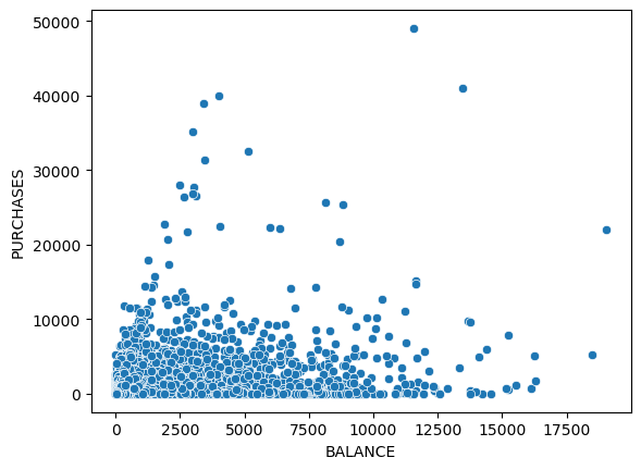
It makes sense when the amount of purchases made is below the balance amount left in their account. There are some outliers such as the user who only has a balance of about $11,000 but has $50,000 purchases. Those users could be business owners who may need a large amount of money so they may need a loan to purchase more.
sns.scatterplot(x='CASH_ADVANCE', y='PAYMENTS',data = df)
Cash Advance is like a short-term loan offered by credit card issuers. People who use cash advance a lot is more likely to need a loan. The user who likes taking cash advances but only makes a small number of payments could be a customer who likes to borrow a loan but may have issues paying off the loan in the future.
sns.scatterplot(x='CASH_ADVANCE', y='BALANCE',data = df)
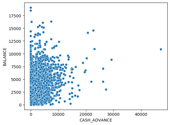
People who have a high balance and high cash advance have a high probability to apply for a loan.
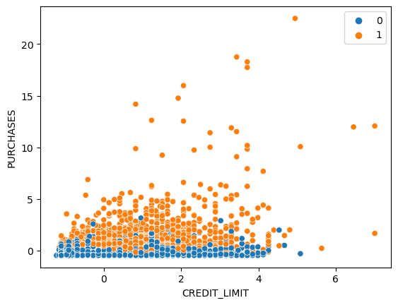
sns.scatterplot(x='CREDIT_LIMIT', y='PURCHASES',data = df)
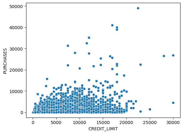
There is a small group of users who make purchases higher than the credit limit, they could be the customer who needs a loan but users with a low credit limit could have a bad credit history.
Preprocessing
Before applying the data to the unsupervised model, we need to standardize the data. Data standardization transforms features to a similar scale. It rescales data with a mean of 0 and a standard deviation of 1. From the analysis above, we can see that some features are from 0 to 1 but some features have a wide range of scope. The dataset has extremely high or low values. Standardization can transform the dataset to a common scale so the training won’t affect by the large different ranges of values.
									scaler = StandardScaler()
data=scaler.fit_transform(df)
data = pd.DataFrame(data, columns=df.columns)
Models
K-Means Clustering
K-means clustering is one of the most popular techniques in unsupervised machine learning, which searches k clusters in your data.
Main steps:
- pick k (number of clusters)
- place k centroids randomly among the training data
- calculate the distance from each centroid to all the points in the training data
- group all the data points with their nearest centroid
- calculate the mean data point in a single cluster and move the previous centroid to the mean location
- repeat for each cluster
- repeat step 2 to step 6 until the centroids don’t move and colors don’t change or the maximum number of iterations has been achieved
Let’s start with a 3 clusters model.
									km_3 = KMeans(3)
km_3_clusters = km_3.fit_predict(data)
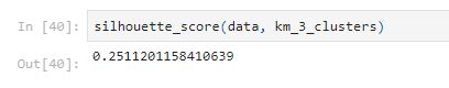
Silhouette score can help evaluate the performance of unsupervised learning methods.The silhouette score is a metric that evaluates how well the data points fit in their clusters. Simplified Silhouette Index = (bi-ai)/(max(ai, bi)), where ai is the distance from data point i to its own cluster centroid and bi is the distance from point i to the nearest cluster centroid. The score ranges from -1 to 1, where 1 indicates the model achieved perfect clusters.
Let’s see what it looks like with some plots.
sns.scatterplot(x='CREDIT_LIMIT', y='PURCHASES',data = data,hue = km_3_clusters)
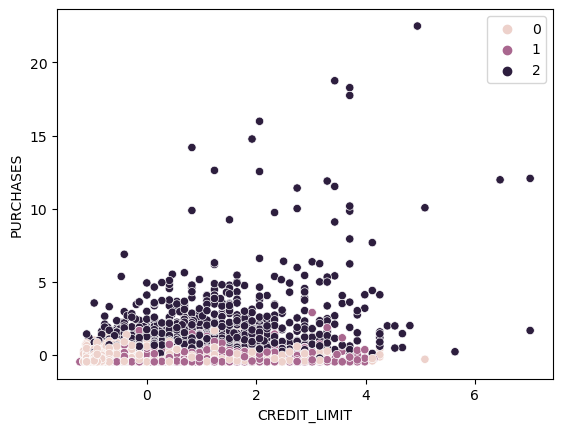
From the plot above, we can see Cluster One is customers with higher purchases. Cluster Zero and Cluster Two are mixing together at the bottom.
Let’s build a for loop for different k values.
									km_list = []
for i in range (2,11):
km = KMeans(i)
km_clusters = km.fit_predict(data)
sil_score = silhouette_score(data, km_clusters)
print(f"k={i} K-Means Clustering: {sil_score}")

km_list.append((i, sil_score))

plt.scatter(x='CREDIT_LIMIT', y='PURCHASES',data = data,c = km_clusters)
plt.title(f"Distribution of K-means clusters based on Credit limit and total purchases when k={i}")
plt.show()

df_km = pd.DataFrame(km_list, columns=['k', 'silhouette_score'])
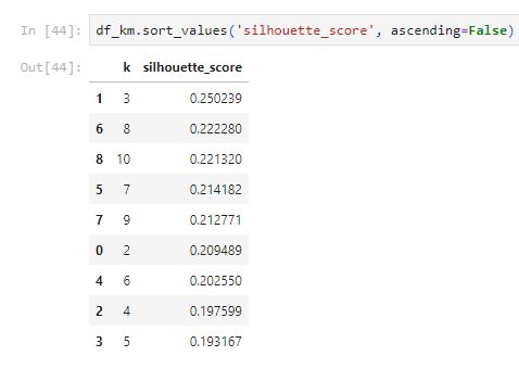
From the table above, k = 3 has the highest silhouette score.
Hierarchical Clustering
Agglomerative Hierarchical clustering treats each data point as its own cluster and then merges similar points together. Linkage defines the calculation of the distances between clusters.
Main steps:
- given n data points, treat each point as an individual cluster
- calculate distance between the centroids of all the clusters in the data
- group the closest clusters or points
- repeat step 2 and step 3 until there is only one single cluster
- plot a dendrogram(tree plots)
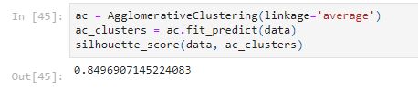
The silhouette_score of 0.8497 is higher.
sns.scatterplot(x='CREDIT_LIMIT', y='PURCHASES',data = data,hue = ac_clusters)
It looks like it group customer based on the purchase amount but only a few points are labeled as cluster 1.
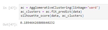
sns.scatterplot(x='CREDIT_LIMIT', y='PURCHASES',data = data,hue = ac_clusters)
The silhouette score of the ward method is low; however, it creates different clusters with more number of point with a label of cluster 1.
Let’s build a for loop trying with different numbers of clusters and different linkage methods.
									ac_list = []
for i in range (2,11):
	for linkage_method in ['single', 'ward', 'average', 'complete']:
		ac = AgglomerativeClustering(n_clusters=i, linkage=linkage_method)
		ac_clusters = ac.fit_predict(data)
		sil_score = silhouette_score(data, ac_clusters)
		print(f"n_clusters={i}, linkage={linkage_method}   Agglomerative Clustering: {sil_score}")

		ac_list.append((i, linkage_method, sil_score))

		plt.scatter(x='CREDIT_LIMIT', y='PURCHASES',data = data,c = ac_clusters)
		plt.title(f"Distribution of Agglomerative clusters (n_clusters={i}, linkage={linkage_method}) based on Credit Limit and Purchases")
		plt.show()
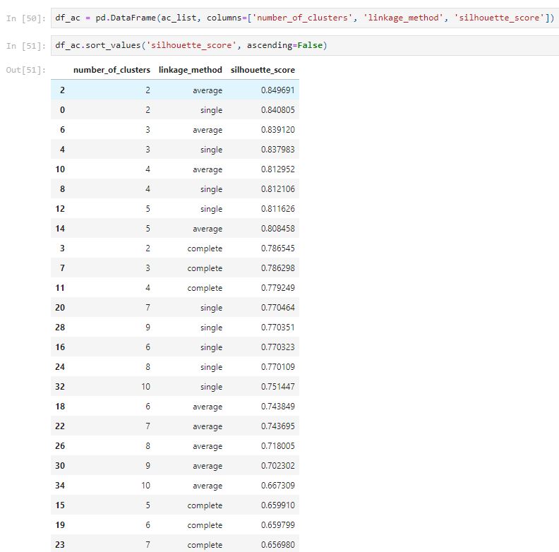
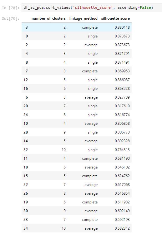
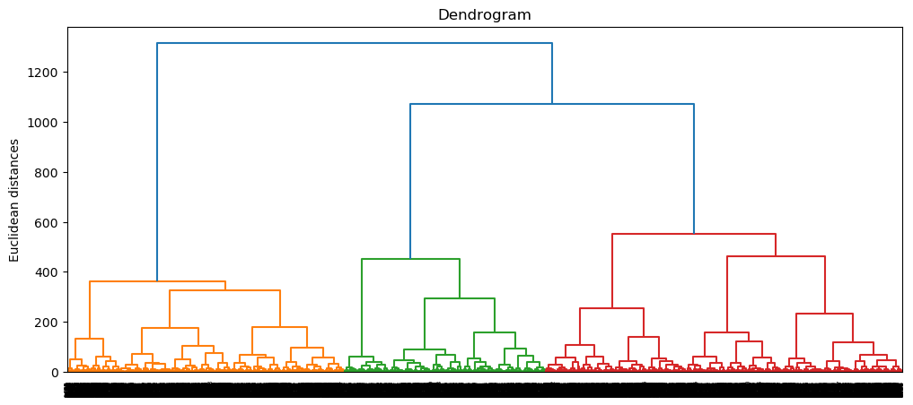
From the above table, the single method has generated a high silhouette score; however, the plots show that it only classifies a few points for a single cluster. The top 8 silhouette score both have issues that only classify a small number of points for a single cluster, which is not good. The complete method with n_clusters equal to 2 seems to have a well classify plot with a high silhouette score of 0.7865.
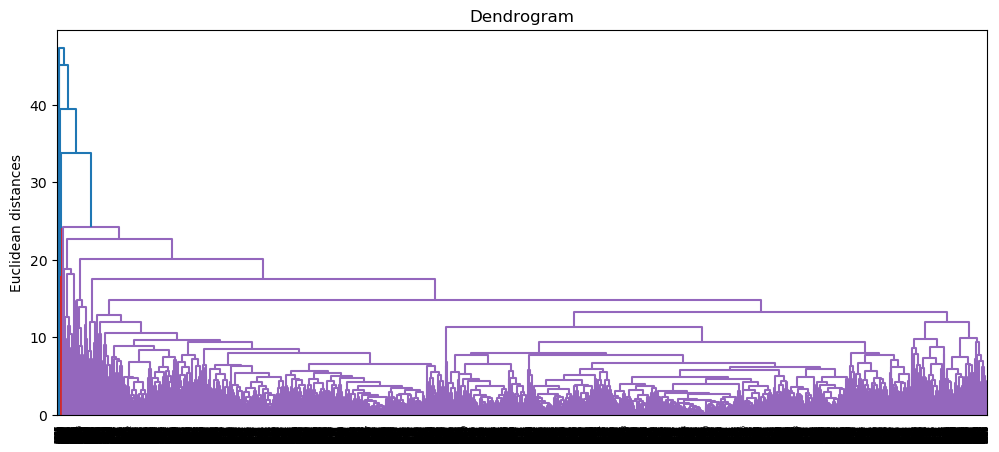
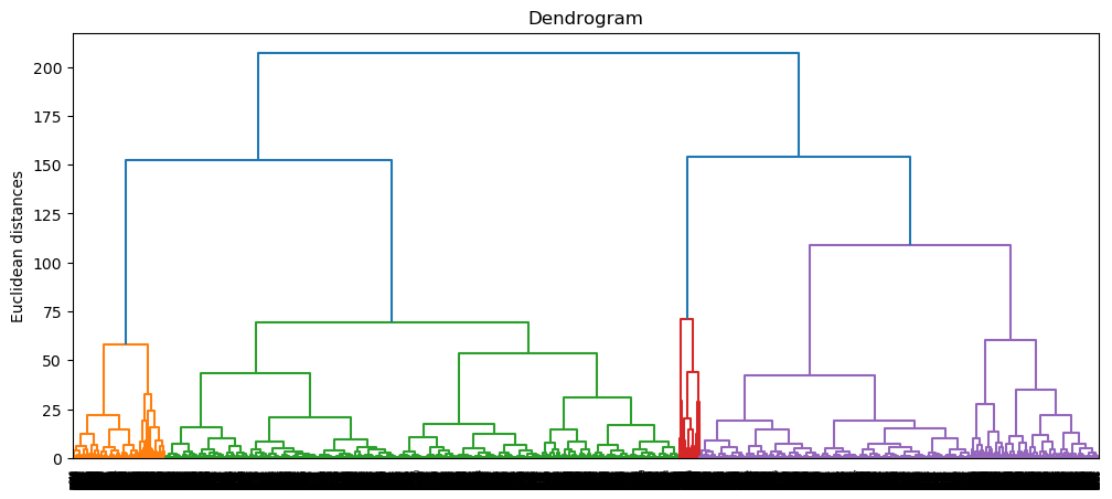
Let’s see what the Dendrogram looks like for the complete method.
									plt.figure(figsize=(12, 5))
dendrogram = sch.dendrogram(sch.linkage(data, method = 'complete'))
plt.title('Dendrogram')
plt.ylabel('Euclidean distances')
plt.show()
Density-Based Spatial Clustering of Applications with Noise (DBSCAN)
DBSCAN groups together data points that are close to each other based on distance measurement and minimum points. The eps parameter controls the maximum distance between two points. The min_samples parameter sets the number of points in a neighbourhood for a data point to be considered as a core point.
Set min_samples as the number of features times two.

Using the knn to find the eps value.
									neighbors = NearestNeighbors(n_neighbors=min_samples)
neighbors_fit = neighbors.fit(data)
distances, indices = neighbors_fit.kneighbors(data)

distances = np.sort(distances, axis=0)
distances = distances[:,1]
plt.plot(distances)
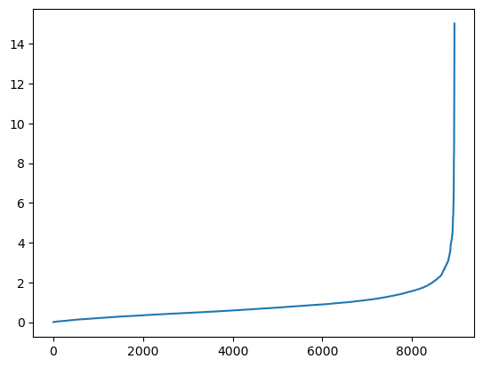
From the plot above, the “elbow” optimization point is around 2; therefore, the optimal value for eps could be around 2.
Evaluate DBSCAN hyperparameters on silhouette score and plots.
									db_list = []

#Evaluate DBSCAN hyperparameters and their effect on the silhouette score
for ep in np.arange(1, 3, 0.5):
	for min_sample in range(10, 40, 4):
		db = DBSCAN(eps=ep, min_samples = min_sample)
		db_clusters = db.fit_predict(data)
		sil_score = silhouette_score(data, db_clusters)
		db_list.append((ep, min_sample, sil_score, len(set(db.labels_))))

		plt.scatter(x='CREDIT_LIMIT', y='PURCHASES',data = data,c = db_clusters)
		plt.title('Epsilon: ' + str(ep) + ' | Minimum Points: ' + str(min_sample))
		plt.show()

		print("Silhouette Score: ", sil_score)
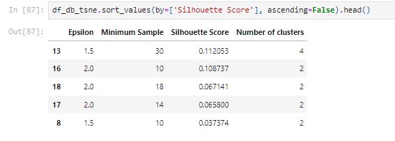
df_db = pd.DataFrame(db_list, columns=['Epsilon', 'Minimum Sample', 'Silhouette Score', 'Number of clusters'])
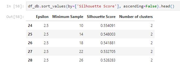
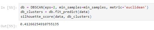
The best performance is the model with eps=2.5 and min_samples=10. The model classifies the data points into two groups.
Dimensionality Reduction
Principal Component Analysis (PCA)
PCA is the most commonly used technique for dimensionality reduction. The first component produced in PCA comprises the majority of information or variance within the data. PCA uses a covariance matrix to measure the relationship between features of the dataset. The eigenvectors tell the directions of the spread of the data. The eigenvalues indicate the relative importance of these directions.
Let’s see what it looks like with when using PCA in 1 dimension.
									# Transform the data with only the first principal component
pca = PCA(n_components=1)

# Store the transformed data in the data_transformed
data_transformed = pca.fit_transform(data.values)
									plt.figure(figsize=(10, 7))
plt.plot(data_transformed)
plt.xlabel('Sample')
plt.ylabel('Transformed Data')
plt.title('The dataset transformed by the principal component')
plt.show()
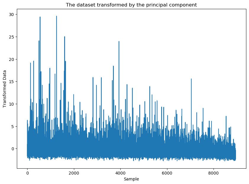
The transformed data are between -3 to 30, the transformed data value are going up and down in the one dimension.
PCA in 2 dimensions
									# Transform the data with only the first two principal components
pca2 = PCA(n_components=2)

# Store the transformed data in the data_transformed
data_pca2 = pca2.fit_transform(data.values)
Let’s check what it looks like with a k-means clustering of n_clusters =8.
									plt.scatter(data_pca2.iloc[:,0],data_pca2.iloc[:,1],c = KMeans(n_clusters=8).fit_predict(data_pca2), cmap =None)
plt.show()
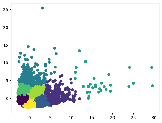
Looks like it has better performance to classify customers into 8 groups with PCA method.
PCA K-means
									km_list_pca = []
for i in range (2,11):
	km = KMeans(i)
	km_clusters = km.fit_predict(data_pca2)
	sil_score = silhouette_score(data_pca2, km_clusters)
	print(f"k={i} K-Means Clustering: {sil_score}")

	km_list_pca.append((i, sil_score))

	plt.scatter(data_pca2.iloc[:,0],data_pca2.iloc[:,1], c = km_clusters, cmap =None)
	plt.title(f"Customer Segmentation with K-means clusters when k={i}")
	plt.xlabel('component 1')
	plt.ylabel('component 2')
	plt.show()

df_km_pca = pd.DataFrame(km_list_pca, columns=['k', 'silhouette_score'])
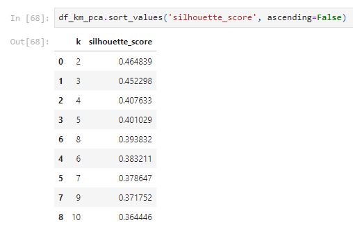
Compare with the k-means without PCA scaled, the silhouette_score of PCA using the k-means method is much better. The best one is when k is equal to 2.
PCA Hierarchical Clustering
									ac_list_pca = []

for i in range (2,11):
	for linkage_method in ['single', 'ward', 'average', 'complete']:
		ac = AgglomerativeClustering(n_clusters=i, linkage=linkage_method)
		ac_clusters = ac.fit_predict(data_pca2)
		sil_score = silhouette_score(data_pca2, ac_clusters)
		print(f"n_clusters={i}, linkage={linkage_method}   Agglomerative Clustering: {sil_score}")

		ac_list_pca.append((i, linkage_method, sil_score))

		plt.scatter(data_pca2.iloc[:,0],data_pca2.iloc[:,1], c = ac_clusters, cmap =None)
		plt.title(f"Customer Segmentation with Agglomerative clusters (n_clusters={i}, linkage={linkage_method})")
		plt.xlabel('component 1')
		plt.ylabel('component 2')
		plt.show()

df_ac_pca = pd.DataFrame(ac_list_pca, columns=['number_of_clusters', 'linkage_method', 'silhouette_score'])
After comparing with the plots and the table above, the ward linkage method seems to have a better distribution of clusters. The ward methods with 4 clusters have the highest silhouette score.
									plt.figure(figsize=(12, 5))
dendrogram = sch.dendrogram(sch.linkage(data_pca2, method = 'ward'))
plt.title('Dendrogram')
plt.ylabel('Euclidean distances')
plt.show()
We can see that the Dendrogram of ward method from PCA generated a much clear relationship.
PCA DBSCAN
									db_list_pca = []

#Evaluate DBSCAN hyperparameters and their effect on the silhouette score
for ep in np.arange(1, 3, 0.5):
	for min_sample in range(2, 20, 4):
		db = DBSCAN(eps=ep, min_samples = min_sample)
		db_clusters = db.fit_predict(data_pca2)
		sil_score = silhouette_score(data_pca2, db_clusters)
		db_list_pca.append((ep, min_sample, sil_score, len(set(db.labels_))))

		plt.scatter(data_pca2.iloc[:,0],data_pca2.iloc[:,1], c = db_clusters, cmap =None)
		plt.title('Customer Segmentation with DBSCAN Epsilon: ' + str(ep) + ' | Minimum Points:
		plt.xlabel('component 1')
		plt.ylabel('component 2')
		plt.show()

		print("Silhouette Score: ", sil_score)
df_db_pca = pd.DataFrame(db_list_pca, columns=['Epsilon', 'Minimum Sample', 'Silhouette Score', 'Number of clusters'])

After comparing with the plots and the table above, the eps = 2.5 and min_samples = 18 seem to generate a better performance with two clusters.
T-Distributed Stochastic Neighbor Embedding (TSNE)
TSNE is also an unsupervised non-linear dimensionality reduction technique. The t-distribution is used when dealing with a small sample size with an unknown population standard deviation.
									model_tsne = TSNE(n_components=2, verbose=1)
data_tsne = model_tsne.fit_transform(data)
Let’s check what it looks like with a k-means clustering of n_clusters =8.
									data_tsne = pd.DataFrame(data_tsne)

plt.scatter(data_tsne.iloc[:,0],data_tsne.iloc[:,1],c = KMeans(n_clusters=8).fit_predict(data_tsne), cmap =None)
plt.show()
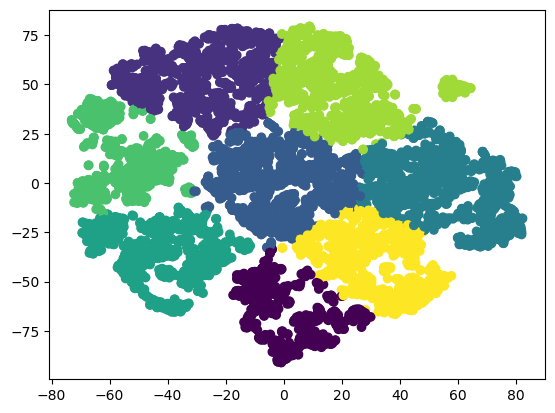
Looks like TSNE has a better performance on scaling the data into two dimensions.
									perplexity_values = [1, 5, 20, 30, 40, 60, 80, 400]
for perp in perplexity_values:
	model_tsne = TSNE(verbose=1, perplexity=perp)
	data_tsne = model_tsne.fit_transform(data)

	data_tsne = pd.DataFrame(data_tsne)

	plt.title(f'Low Dimensional Representation of Customer Segmentation. Perplexity {perp}');
	plt.scatter(data_tsne.iloc[:,0],data_tsne.iloc[:,1], c = KMeans(3).fit_predict(data_pca2), cmap =None)
	plt.figure(figsize=(10, 7))
From the plots, most of the data points are at the center of the plot when the perplexity value is equal to 1. The plot is hard to identify any patterns and clusters when the perplexity is equal to 1. When the perplexity value increase, the relationship of clusters is getting clear. However, the perplexity value of 400 seems to be too high.
Let’s check how it performs with a k-means clustering of n_clusters =8:
									perplexity_values = [1, 5, 20, 30, 40, 60, 80, 400]
for perp in perplexity_values:
	model_tsne = TSNE(verbose=1, perplexity=perp)
	data_tsne = model_tsne.fit_transform(data)

	data_tsne = pd.DataFrame(data_tsne)

	plt.title(f'Low Dimensional Representation of Customer Segmentation. Perplexity {perp}');
	plt.scatter(data_tsne.iloc[:,0],data_tsne.iloc[:,1], c = KMeans(n_clusters=8).fit_predict(data_tsne), cmap =None)
	plt.figure(figsize=(10, 7))
From the plots, most of the data points are at the center of the plot when the perplexity value is equal to 1. The data points are still too close to the middle of the plot when the perplexity value is equal to 5. The plots of 20 to 60 seem to generate a clear relationship. Therefore, we choose the default perplexity value of 30 for the TSNE model.
TSNE K-means
									km_list_tsne = []
for i in range (2,11):
	km = KMeans(i)
	km_clusters = km.fit_predict(data_tsne)
	sil_score = silhouette_score(data_tsne, km_clusters)
	print(f"k={i} K-Means Clustering: {sil_score}")

	km_list_tsne.append((i, sil_score))

	plt.scatter(data_tsne.iloc[:,0],data_tsne.iloc[:,1], c = km_clusters, cmap =None)
	plt.title(f"Customer Segmentation with K-means clusters when k={i}")
	plt.xlabel('component 1')
	plt.ylabel('component 2')
	plt.show()

df_km_tsne = pd.DataFrame(km_list_tsne, columns=['k', 'silhouette_score'])
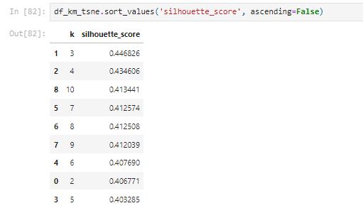
The k-means clustering with tsne scaled data seems to have the best performance when k is equal to 3. However, compared with pca scaled data with k-means, the silhouette_score is a little bit lower.
TSNE Hierarchical Clustering
									ac_list_tsne = []

for i in range (2,11):
	for linkage_method in ['single', 'ward', 'average', 'complete']:
		ac = AgglomerativeClustering(n_clusters=i, linkage=linkage_method)
		ac_clusters = ac.fit_predict(data_tsne)
		sil_score = silhouette_score(data_tsne, ac_clusters)
		print(f"n_clusters={i}, linkage={linkage_method}   Agglomerative Clustering: {sil_score}")

		ac_list_tsne.append((i, linkage_method, sil_score))

		plt.scatter(data_tsne.iloc[:,0],data_tsne.iloc[:,1], c = ac_clusters, cmap =None)
		plt.title(f"Customer Segmentation with Agglomerative clusters (n_clusters={i}, linkage={linkage_method})")
		plt.xlabel('component 1')
		plt.ylabel('component 2')
		plt.show()

df_ac_tsne = pd.DataFrame(ac_list_tsne, columns=['number_of_clusters', 'linkage_method', 'silhouette_score'])
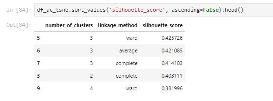
After comparing with the top five silhouette_score and the above plots, the linkage_method of the ward with number_of_clusters of 3 has the best performance. The score is better than the PCA method.
									plt.figure(figsize=(12, 5))
dendrogram = sch.dendrogram(sch.linkage(data_tsne, method = 'ward'))
plt.title('Dendrogram')
plt.ylabel('Euclidean distances')
plt.show()
We can see that the Dendrogram of ward method from TSNE generated a clear relationship.
TSNE DBSCAN
									db_list_tsne = []

#Evaluate DBSCAN hyperparameters and their effect on the silhouette score
for ep in np.arange(1.0, 2.5, 0.5):
	for min_sample in range(10, 40, 4):
		db = DBSCAN(eps=ep, min_samples = min_sample)
		db_clusters = db.fit_predict(data_tsne)
		sil_score = silhouette_score(data_tsne, db_clusters)
		db_list_tsne.append((ep, min_sample, sil_score, len(set(db.labels_))))

		plt.scatter(data_tsne.iloc[:,0],data_tsne.iloc[:,1], c = db_clusters, cmap =None)
		plt.title('Customer Segmentation with DBSCAN Epsilon: ' + str(ep) + ' | Minimum Points: ' + str(min_sample))
	plt.xlabel('component 1')
		plt.ylabel('component 2')
		plt.show()

		print("Silhouette Score: ", sil_score)

df_db_tsne = pd.DataFrame(db_list_tsne, columns=['Epsilon', 'Minimum Sample', 'Silhouette Score', 'Number of clusters'])
From the above table, we can see that the silhouette scores are low with tsne.
Discussion
Let’s create a summary table with the best silhouette_score from each method.
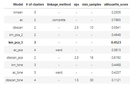
From the table above, the silhouette score is highest when the number of clusters is equal to two. However, after comparing with the plots that we generated before, 3 clusters can help us get better insights from the data. Moreover, most methods with 3 clusters are able to generate a desired silhouette_score. Since the model km_pca_3 has the highest silhouette_score, it is chosen to be the best model from the above analysis. The silhouette score of 0.4523 is desirable.
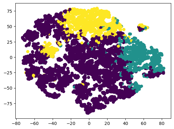
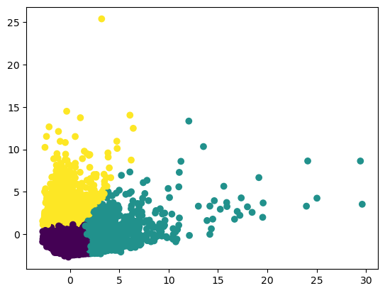
Let’s visualize the detailed performance of the model km_pca_3.
Using PCA to visualization PCA scaled data with k-means of n_clusters=3.
									plt.scatter(data_pca2.iloc[:,0],data_pca2.iloc[:,1], c = km_pca_3, cmap =None)
plt.show()
Using TSNE to visualization PCA scaled data with k-means of n_clusters=3:
									km_pca_3 = KMeans(3).fit_predict(data_pca2)
print(f"k=3 K-Means Clustering: {silhouette_score(data_pca2, km_pca_3)}")
#labels_km_pca_3 = km_pca_3.labels_
plt.scatter(data_tsne.iloc[:,0],data_tsne.iloc[:,1], c = km_pca_3, cmap =None)
plt.show()

Create a new data frame to combine clusters with the original data.
df_km_pca_3 = pd.concat([df.reset_index(drop=True), pd.DataFrame({'cluster':km_pca_3}).reset_index(drop=True)], axis=1)Use countplot to count the number of data within that cluster.
sns.countplot(x='cluster', data=df_km_pca_3)
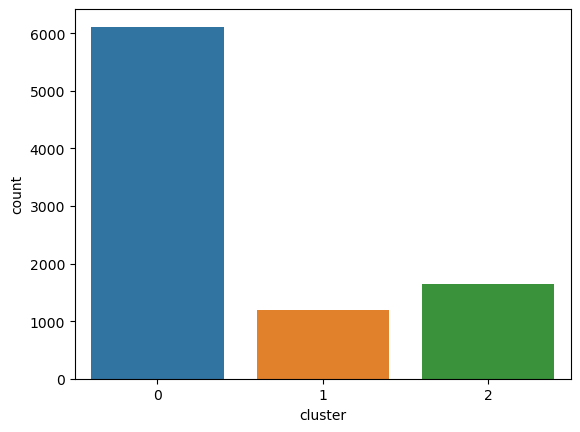
There are larger amounts of customers in cluster 0.
Let’s create some plots to see the distribution of different features for each cluster.
									for c in df_km_pca_3.drop(['cluster'],axis=1):
	grid= sns.FacetGrid(df_km_pca_3, col='cluster')
	grid= grid.map(plt.hist, c)
plt.show()
Create plots that focus on the important features.
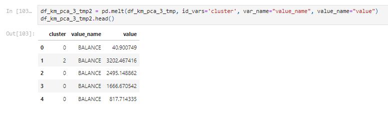
df_km_pca_3_tmp = df_km_pca_3[['BALANCE', 'PURCHASES', 'ONEOFF_PURCHASES', 'INSTALLMENTS_PURCHASES', 'CASH_ADVANCE', 'CREDIT_LIMIT', 'PAYMENTS', 'cluster']]
sns.catplot(data=df_km_pca_3_tmp2, x="cluster", y="value", hue="value_name", kind='bar', height=5, aspect=2)
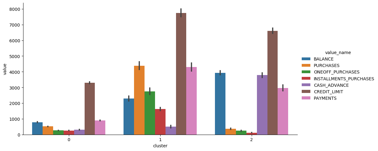
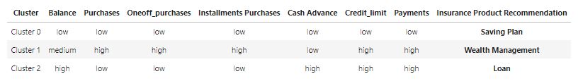
Let’s create a summary table for these three customer groups:
Recommendation:
Cluster 0: Customers who have low balances, low credit limits, and low purchases. These customers could be low-income and don’t likely spend too much on purchasing goods. We should offer a saving plan for them.
Cluster 1: Customers who have high credit limits, high purchases, low cash advance, and high payments. These customers could be medium and high-income customers who are able to pay for their credit cards on time. They don’t use cash advance too often; therefore, we should offer a wealth management plan for this group of customers.
Cluster 2: Customers who have a high balance, low purchase, high cash advance, high credit limit, and high payments. Customers who use cash advance a lot is more likely to need a loan. Therefore, we should offer a loan plan for this group of customers
Conclusion
The study explored a range of different clustering algorithms such as k-means, hierarchical clustering, and DBSCAN. Standardization is useful for unsupervised models that require distance metrics. Different hyperparameters are evaluated with the silhouette score. The silhouette score is a metric that helps evaluate the performance of unsupervised learning methods. PCA and TSNE are methods used for dimensionality reduction and visualization in the project. After comparing with the silhouette score and visualized plots, ‘3’ is the optimal number of clusters for the dataset. The PCA scaled data that used the k-means method with a k value of three is the optimal choice.
Based on the above analysis, customers can be divided into three groups. The first group of customers are low-incomers and small spenders; therefore, a saving plan is recommended for this group. The second group of customers are able to pay for credit cards on time and don’t like to use cash advance so the company should offer a wealth management plan for this group. The last group of customers who use cash advance a lot are more likely to accept a loan plan from the insurance company.
Citations
Jillani Soft Tech.(September, 2022). Market Segmentation in Insurance Unsupervised. Retrieved from https://www.kaggle.com/datasets/jillanisofttech/market-segmentation-in-insurance-unsupervised.